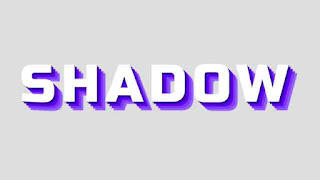
Today in this blog I will share a snippet about text effects. This is a text-shadow animation that occurs on mouseover and returns to its previous state when we remove the cursor. You can watch the demo to see how the snippets will look.
I hope you have watched the video demo. There are many different types of animations that can be made with CSS. It doesn't require knowledge of the advanced language or JavaScript. We can use simple HTML and CSS properties to create awesome animations.
In this project, we have taken a text called 'shadow' in the HTML File. We will make this a stacked text-shadow effect on hover. In the CSS Part, we first eliminated the default margin and padding of the project. We gave the text some necessary styles like color, font size, letter-spacing, etc. We also set a transition effect for the text-shadow animation. In this way, the animation will occur smoothly. We used absolute postin value to take the text in the middle of the viewport. we have applied the text-shadow animation for the hover state. To achieve this effect, we use multiple blue shades of text shadows. We took the text-shadow effect in such a way that it creates a stacked effect on hove.
You May also like:
Creative Text Shadow Effect On hover [ Source Code ]:
After creating the necessary files, please copy the code from the code box below and paste it into your project. Save and check in the browser. If it works well then it's okay but if it doesn't then you should download the source code from the button below.
ADD HTML:
ADD CSS:
Hopefully, your code is working. We regularly publish source codes related to front-end development. If you find the code useful, visit our website frequently. Please share the articles with like-minded people. We want to thank you for your visit.


Post a Comment
Please do not enter any spam link in the comment box.