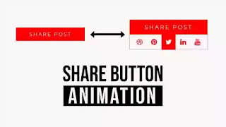
It's not easy to find a good example of a share button animation on the internet. In this article, I have made one for you, and I'm sure it's not the only one out there, but I hope it helps you a bit to make your own. I know this is very basic, but I wanted to make it as simple as possible. A button is one of the most important UI elements of any website to app. Buttons have the power to make the user click on them if the UI of that button is eye-catchy. Buttons are basically the mediator between the users and conversions. The button hovers effect is something we are going to discuss today. When we hover over the share button, the front part will slide up slowly and we will see the social media share buttons. There will be a hover effect for the icons. In order to have a clear idea of what we are creating, please watch the below video demo.
We have taken a div called 'wrapper' We took another div and named it the 'box'. We have taken five anchor tags and added a bunch of social media icons inside. That is the end of the project's code.
The default margin and padding will be removed by taking them to zero in the CSS part. Montserrat is the primary style for the project. You are free to take whatever you want. The elements of the project have been aligned with the display flex property. We gave the box's position a relative value. The front part of the button was created using pseudo-elements. The red background was created by the 'before' elements. The text 'share post' is created using the pseudo-element 'after'. We created a hover effect for the pseudo-elements.
You May Also like:
Share Button Animation using HTML CSS [ Source Code ]:
You have to create two files to create this sample. You can paste the code from the below code boxes into your project. The source code can be downloaded from the button below if you have a problem with the code below.
ADD HTML:
ADD CSS:


Post a Comment
Please do not enter any spam link in the comment box.