In this blog, we will learn how to create a CSS pulse animation. If you want more snippets on CSS animation examples, HTML CSS, jquery, javascript then click the load more button on the homepage. Watch the video demo below to get some idea about the snippet.
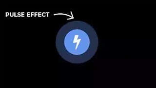
I hope you have watched the video demo. Pulse animation is commonly used to draw the attention of a user. In this snippet, we are going to create pulse effect animation in CSS. At First, we need to create two div tags where one is placed inside another. The container div will be named as the wrapper. The div inside that will be named as a box. Inside the 'box' we have placed a font-awesome icon.
In the CSS part, we have eliminated the default margin and padding by setting them to zero. The background is set to black but, you can choose whatever color you want. After that, we aligned the wrapper div at the center of the viewport. For that, we used absolute position value and CSS transform property. We gave the 'box' div a particular height and width of 100px. Then we set the animation value for the CSS pulse animation. Here animate is animation-name, 2s is the animation duration, linear is the animation timing function, and infinite is the animation iteration count value. Inside the @keyframes at 0%, we are setting the box-shadow opacity to 0 and, the color will be cornflower blue. When the animation reaches 40%, we are spreading the box shadow around the circle by 50px so that we can see the pulse effect. We set the same value for 80%. When the animation reaches 100%, the box-shadow value will go back to 0.
You May Also Like:
CSS Pulse animation [ Source Code ]:
First, create two files. One is HTML and, the other one is CSS. Please Copy the code below and paste them into your project.
HTML
CSS:
That's all. You have successfully implemented the code. Please follow us for more snippets like this shortly. Thank you for visiting the blog.


Post a Comment
Please do not enter any spam link in the comment box.